Posts from the category Internet
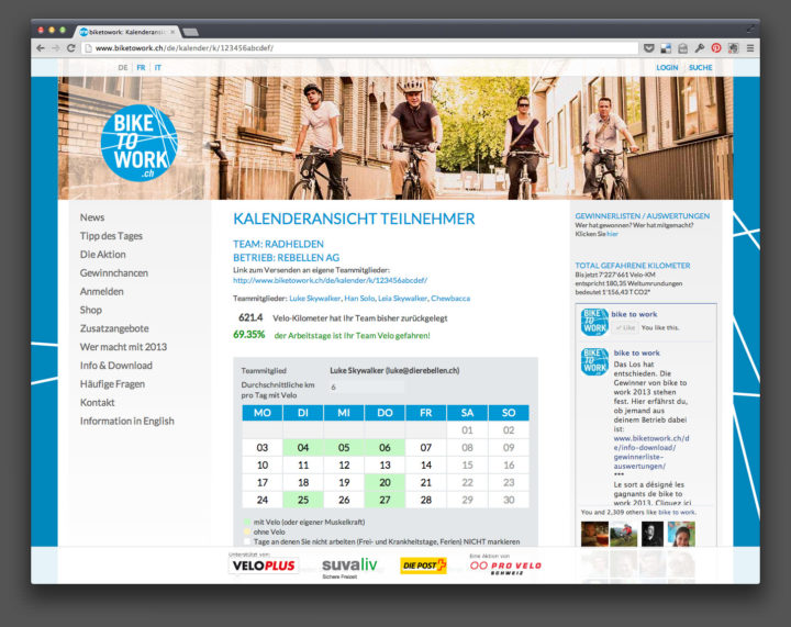
Technical case study: Bike To Work
Published in
Back in 2011, the organizers of Bike To Work Switzerland approached my employer !frappant Webfactory to re-develop their website and the participants’ admin system. I worked with a third-party usability consultant to re-think and re-design the project, before I carried out the design work in Photoshop and the team and I subsequently produced the website on the base…
I’m annoyed and disappointed by the fact that a travel website from the USA has decided to augment and support its business by taking images from various online sources – including Flickr – and using them in contravention of the photos’ licensing terms. I’ve written the following email to the administrators of the website and…
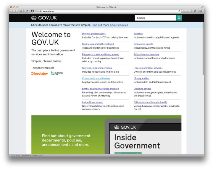
Breaking the mould for website navigation
Published in
The British Design Museum has announced its nominations for the 2013 Design Awards, amongst them the fascinating Rain Room und the latest Windows Phone. But the nomination which interests me the most is the British government’s website gov.uk. The website is the latest version which attempts to begin bringing all of the various government websites under one roof;…
Photo sharing
Published in
The latest version of the mobile phone app from Flickr, released yesterday, helps me to continue to prune my photo sharing accounts elsewhere.
Serving a multilingual website audience
Published in
The latest article at A List Apart is a must-read for anyone serious about developing and running a website which should attract visitors who speak languages other than English.

Upright and proud
Published in
The new, re-designed website is now online and is automatically optimized for visitors with iPads and smartphones. One of the aspects of the design is an improvement to how images in vertical format are displayed.
If you’re like me, a web developer, and programme responsive web layouts using @media queries, you’ll often get lost knowing precisely which set of rules are currently applied to the page. Here’s a handy tip to make things easier.
The Six Year Itch
Published in
I have finally been able to completely re-build this website from the ground up, using responsive design principles and many new features. This first technical post summarizes the reasons behind the need for a new version.
Learning from the masters
Published in
I re-discover the web technology podcast “Big Web Show” and look forward to hearing all of the back episodes.
Good things
Published in
Cool new techniques for creating responsive websites and for saving you loads of time when writing CSS are helping me to rebuild the technical infrastructure of this (and other) websites.
Mobile to the Future
Published in
First there was print, then recordings, then cinema, radio, TV, and the internet. Mobile is the seventh and latest form of mass media. And the smartphone is the fastest spreading technology in history. More iPhones are activated every day than babies are born. Read Jeffrey Zeldman’s notes on Luke Wroblewski’s “Mobile To The Future” presentation…
Brain Dump
Published in
A great coincidence, after yesterday’s post, that US web developer Jason Santa Maria has linked to a list of tips by Pixar story artist Emma Coats, who has tweeted a series of “story basics” recently: guidelines that she learned from her more senior colleagues on how to create appealing stories. The tips are just as…
Code snippet for SQL use, to include a formatted version of a timestamp field in database query results.
New programming techniques in my daily workflow
Published in
While my main hobby in my private life is photography, I earn my living through programming websites. Since moving to !frappant back in April last year – has it really been a year already?! – I’ve been striving to learn as many new techniques as possible. It’s been a particular goal to get out of…
Shift + refresh
Published in
Time for a re-think on how this website is organized and laid out. Priorities will be a more graphically appealing portfolio, a more easily scannable “blog” section, and a Mobile First approach to design and functionality. Stay tuned. (But don’t hold your breath while you do. It may be a while.)

Flexible by default
Published in
One of the great things about being responsible for the technical direction of a team of developers is that you get to bring your ideas to a project and, in many instances, try out new techniques which would otherwise only be seen on a personal website or blog. I wrote at the beginning of the…
