You’re soaking in the re-designed and re–programmed version of the website, which I quietly launched earlier this week. The content of the site remains the same, but it is now optimized automatically not just for viewing on desktop computers but also iPhones, Android mobiles and iPads. Visitors with smaller devices such as smartphones get smaller photos automatically, which will improve the loading times for them automatically. Typography played a big role in the re-design and I’ll be writing about that in a future post.
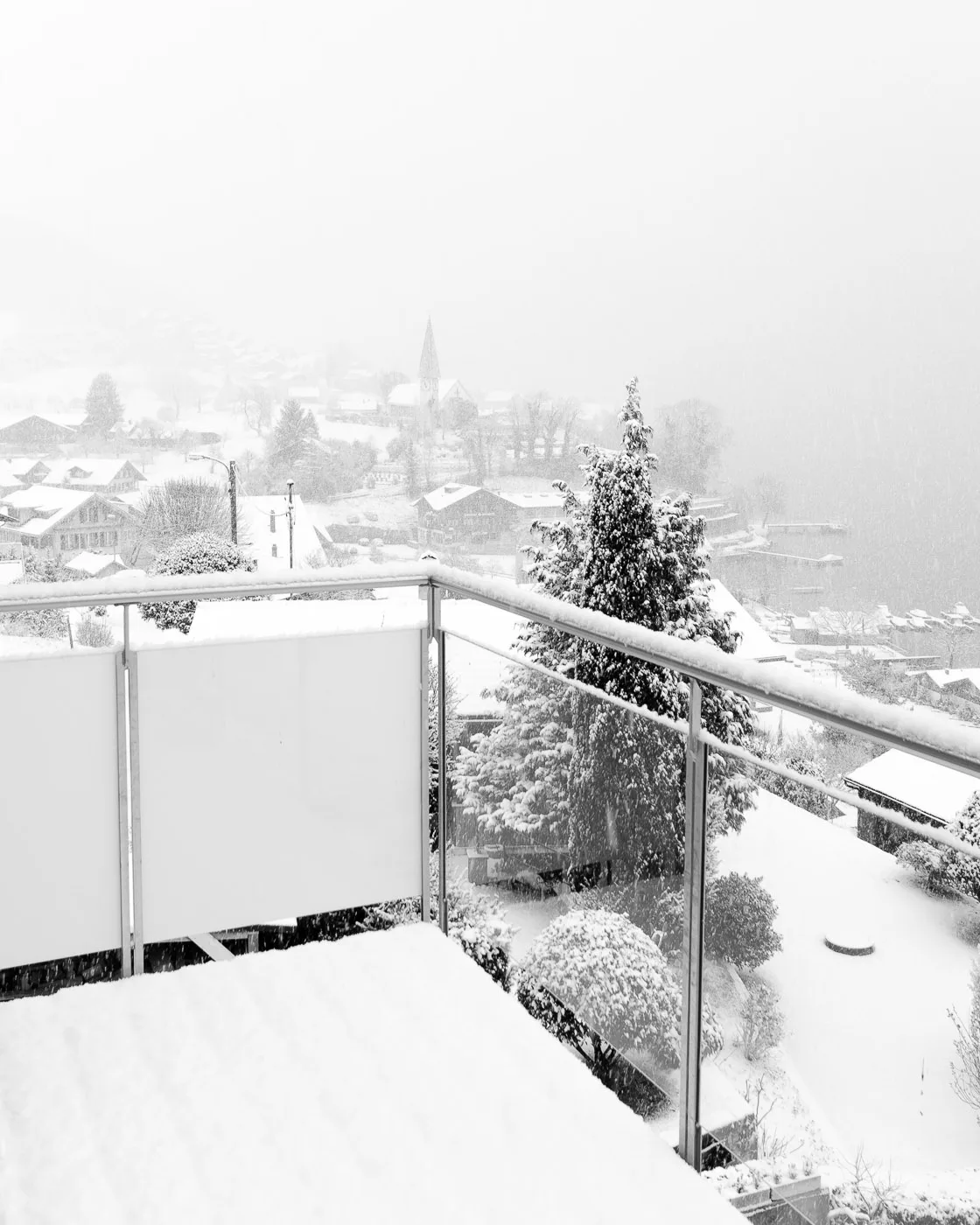
One of the key parts of the re-design was to improve the display of images in vertical format. Where the large image section at the top of each photographic post was great for showing photos in horizontal format, it wasn’t at all good for showing images in square or vertical format. Because much of my photography is destined for the website, that actually influenced how I took photos. Subliminally, I knew that they weren’t going to look good in vertical format and so I took the majority of my photos in horizontal format. Now that the site is online, I can concentrate on the image, rather than how it will look online.

