One of the great things about being responsible for the technical direction of a team of developers is that you get to bring your ideas to a project and, in many instances, try out new techniques which would otherwise only be seen on a personal website or blog. I wrote at the beginning of the year about the Burson-Marsteller EMEA websites, which I programmed and produced for my previous employer using WordPress, a lot of long days and troublesome code reviews, and the knowledge I’ve gained over the past goodness knows how many years of programming for blog websites. The result was a whole year’s worth of coding experience, which stood me in good stead for getting back into the stream of web development.
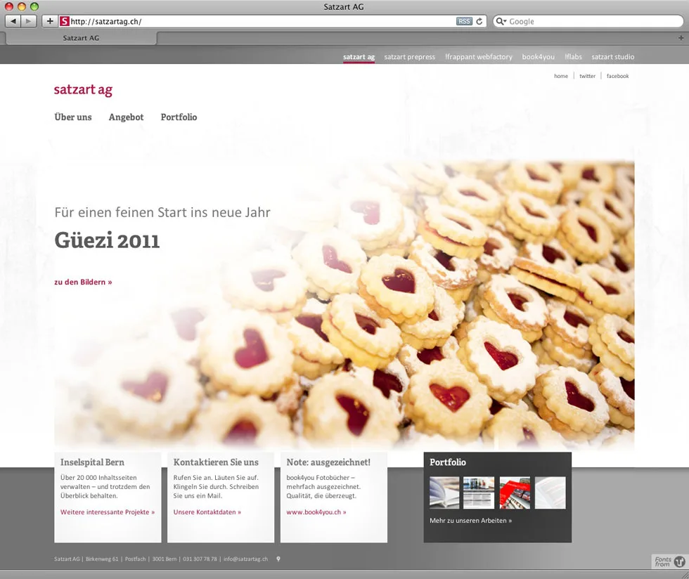
 When I started my current job as Technical Manager of !frappant, one of the first tasks we discussed was the long-overdue relaunch of the company website. Frappant is the web division of Satzart AG and stands alongside Satzart Prepress, !flabs and book4you as part of a single company covering all the bases in creative development. The new website was to reflect that; the design coming from the Prepress division to me, where I would again bend and shape WordPress to create the new company site. Where each division of the company had presented itself individually, each division would be visibly part of the whole company, promoting each of the other divisions and presenting itself under the new online company identity. The project was slotted in amongst our client projects this year and we went online with the new website around a week ago.
From a technical point of view, design decisions such as typography and layout for the new website had already been made. That meant I had free hand to concentrate on the conversion of the layout into a functional website. My primary goal – aside from producing the website to match the high hopes of the management team – was spurred on by the fact that our agency is a creative one: that our portfolio had a place online which showed our best work in a way which would in itself be a portfolio work.
 I’ve written about responsive design before and am a strong believer in the principle that if the project allows for it, every website we produce must be viewable on the widest range of devices possible. Back in 2010, when I produced my own portfolio website in preparation for job interviews, I made my first flexible website. Flexible in the way that the layout adjusted itself automatically to be viewed in an optimal way on a range of devices: from the small screens of iPhone and Android smartphones to the iPad and on up to the desktop web browser. It’s easy to say, as a web agency, that you have a good basis of experience of producing mobile solutions as part of a web portfolio, but a working example is the best piece of portfolio work one can show.
I’m not going to go into all of the technical details here, as I’ll be writing all night and you’ll doze off long before I’ve finished! Suffice it to say that the single version of the website is not just the regular desktop version, but also the iPad version and the smartphone version in one. For an excellent introduction to the techniques used to create the responsive layout, check out the book “Responsive Design” in the A Book Apart online bookstore.

