I revised my professional online portfolio at the end of last year, in order to provide a more up-to-date overview of my current and recent work. (The portfolio was only made available to interested parties via login access, and has since been de-activated.) I wanted to completely re-design the site, re-write the content, and bring it up-to-date on a technical level. The first stage was to re-design the site, and so I used my regular tool – Adobe Photoshop – to mock up the page layout. From there, I converted the mockup into a working HTML and CSS layout, using hand-coding skills I’ve learned and refined over the past fifteen years.
I wanted to make my first forays into HTML5, improve my dynamic scripting skills, and turn the WordPress knowledge I gained during the EMEA project for Burson-Marsteller to my own advantage. I also wanted to try out a new technique in user experience: namely, the dynamic provision of a web page layout according to the size of the visitor’s web browser. This is becoming known as responsive design; a useful term, albeit one which hints at the fact that the technology has been around for quite a while (had I had the nouse to actually think about it).
My starting point for this project would be the regular browser width of 1024px, which is the size of a fully maximized browser window on small laptop screens. This is the “go-to” size, which I have used as a default for the past eight to ten years, leading on from the days when most desktop monitors were as small as modern laptop screens.

Once I had programmed and cross-checked the primary layout for the website in the usual desktop web browsers ((The layout and functionality was tested in Windows – Internet Explorer 6-8, Firefox, Google Chrome – and on Mac: Firefox 3-4, Google Chrome, Safari.)), seen above, I then shrank my browser window and started to analyse how users would interact with the site at this narrower resolution. I decided that horizontal scrolling, while acceptable for creative websites, wasn’t appropriate to a primarily text-based online portfolio. Managers and h.r. specialists could well find a level of unusual navigation confusing or annoying, so I decided to keep the layout simple, and add dynamic responsive design functionality using Javascript.
The idea of adding a dynamic function to adjust the layout of a website according to browser size is one which I saw not that long ago when Information Architects implemented this very technology on their website. A user’s web browser size can only effectively be gauged at runtime using Javascript, but despite the fact that Javascript is pretty ubiquitous in all but the most paranoid of users’ desktop browsers, I decided that the use of such a function should only enhance the visitor’s experience, not define it. If a website can’t be read without an essential plugin or can only be read with Javascript activated, this is a serious blocker. Visitors to the website with Javascript deactivated would therefore only see the standard layout shown above.
Dynamic scripting and the responsive layout
As in most modern development projects, the use of a reliable code library is key. I decided to use jQuery as a core library on which to build the dynamic layout functionality, as it has proven to be all but bullet-proof in the projects that I’ve seen. Further advantages of this pre-existing code library is that it’s a small, practically unnoticeable download for the website visitor, and usage from a developer’s point of view is simple.
Using a very simple piece of my own JavaScript, I added an event tracker which does two things. Firstly, the code checks the browser window size when the page has fully rendered, and modifies the main CSS class name on the <body> tag if the browser window width is smaller than the minimum value of 1024px. (Noting that the browser window is most likely to be smaller than the screen width.) A secondary function then reacts every time the size of the browser changes, calling the main logic function and making adjustments as appropriate. This second function is in place in case the visitor shrinks the size of the browser, once the page has loaded.
By monitoring the size of the browser window, I can assign rules in the main stylesheet which only apply when the class name is applied. By using CSS identifiers such as body.narrow aside {}, I can define new widths, new float clearance rules and even new typography rules for the page in a smaller browser window. The main aim is to provide the visitor with a page which is optimized for his or her screen.
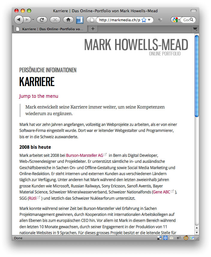
For example: in the case of a small, narrow browser window, there is little point in taking up important space at the top of the page to display the grey self portrait you can see in the screenshot above. So, that’s removed using the display:none rule in CSS. The margin applied to the top of the main content box – invoked in the “regular” layout to keep the text legible and below the aforementioned image – is removed. Therefore, the visitor is presented with as much content “above the crease” as possible.
By narrowing the browser window, the positioning of the main menu to the right of the content column was problematic. Should the menu continue to be displayed in the same position in the narrower layout, the content would have to be made much narrower, thereby degrading legibility through short line lengths. So, the menu was moved to the area below the content, with the addition of a “jump to the menu” helper link, as can be seen in the screenshot below. This link is shown in narrow layouts using CSS; although the link is present in the regular layout, it is hidden from the user: again, by use of the CSS code display:none.
Similar custom CSS rules are also applied to the text for narrower browsers; the lead-in text on each page is adjusted and text sizing in the menu made more compact. Such attention to detail is important when considering the legibility and visual appearance of a website, which is best achieved through live testing on a per-website basis. The revisions to the CSS code for the smaller browser mean that the layout looks just as professional and complete as it did at the wider resolution, albeit with less individual page elements in the first view.

So, what about mobile devices?

Mobile devices such as the Apple iPhone all have their own quirks and special handling is required in pretty much all instances; for example, touch-screen devices are generally much smaller than a desktop equivalent, and interactions such as those performed when the visitor uses the mouse pointer to “roll over” an element are often unsuitable. (You cannot usually “roll over” a page element when a touch screen is in use.)
A key part of designing for the web is identifying your intended audience; in the same way that I made experience- and statistic-based decisions as to the most common browser size and type, I also decided that the majority of visitors would be visiting the site using a desktop web browser. The widespread take-up of the iPhone and iPad over the past couple of years led me to ensure that the iPhone, with its small screen size, was also well supported. As I’d already written layout rules for narrow screen sizes, which would be automatically applied using the dynamic Javascript detailed above, all that remained was to add simple PHP-based browser detection code for the iPhone and call a brief, 13 line CSS file to make minor typographic adjustments for that device. Although the iPhone can dynamically shrink pages to fit within its screen size, I decided to block that re-sizing feature and tailor the text sizing by hand.
Future development
This kind of experience-enhancing attention to design and interaction is something I plan to focus on in the future and implement to every new website I build from now on. The main lesson I learned from my experiences on this first attempt is how simple it is to implement such dynamic rules. The functionality which makes it work invokes only half a dozen short lines of Javascript code – based on the jQuery code library, which you are probably already being called by default if you’re using a CMS such as WordPress – and the CSS rules are rarely complicated, if you have a solid and logical HTML base to work on. My next project for re-coding will be Permanent Tourist: the page you’re reading now hasn’t been dynamized yet, but has already been re-structured and re-coded using HTML5 in preparation of the upcoming improvements.

One response to “Responsive design using CSS and Javascript”