Posts about web design
The wonders of CSS Grid
Published in
I’m beginning to delve into the newest extension of the CSS style rule possibilities at a professional level, in order to design and create websites which break the mould.
Saying hello to a better future
Published in
I’m moving to Swiss web agency Say Hello as partner, client consultant and full-stack developer from January 2019.
How to get your visitors where they need to be
Published in
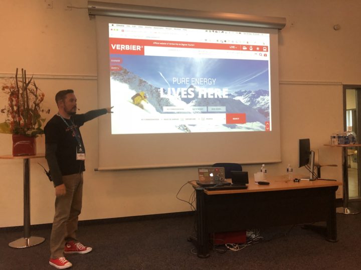
I presented at the WordCamp conference in Lausanne a couple of weeks ago, on the subject of website usability. The video of my talk is now online.
Speaking at WordCamp Lausanne
Published in
I’m presenting at WordCamp Lausanne at the end of September. Come and hear me talk about user interfaces and usability, and get your questions answered too.
Speaking at WordCamp Bern
Published in
Through my participation of the regular and sociable “WordPress Meetup” in Bern, I was one of the volunteers who helped organize the WordCamp conference in Switzerland’s capital last weekend.
Screen resolutions in Sketch
Published in
Defining custom artboards in Sketch to better reflect modern screen resolutions.
An analysis of the visitor statistics during a recent web project showed that a large number of visitors were visiting the site using medium-small devices with 1024px x 768px screens. This corresponds to an iPad held in horizontal format. But further research into the statistics showed that a large proportion of the visitors with this screen
Website: Gemeinde Interlaken
Published in
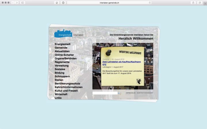
Eleven years later, and Interlaken Town Council are still using the website I built for them. It may not be programmed for optimal use on mobile devices, pre-dating the iPhone by three years, but it still works flawlessly.
Some website designs from my archive
Published in
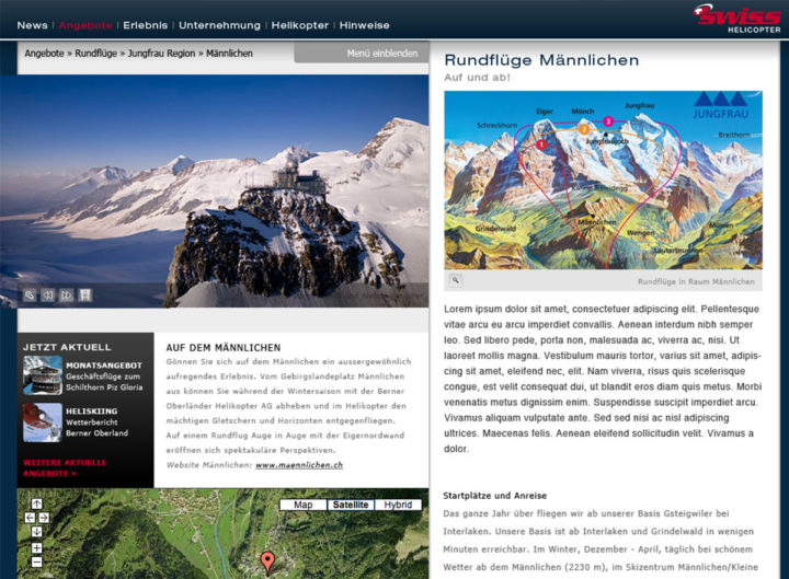
Until I had to switch to doing mainly technical work on web projects, I used to do a lot of design work. I came across my old designs when clearing out my home office and thought you’d like to see a few of them.
Vertical rhythm in web typography
Published in
…doesn’t have anything to do with jumping up and down to music. Sadly. Typographic principles are just as valid in designing for the web as they are in designing for traditional media. Through the application of a very simple mathematical principle, a design becomes more peaceful and the visitor is calmed by a subliminally identifiable pattern. (Our
“The fold” is still very important in web design
Published in
Website visitors can and do scroll the page to find what they’re looking for. That doesn’t make this scrolling action a good user interface design solution.
Containers and modules in web design
Published in
Using modules in front end web programming to allow more flexibility and more independence from site layouts for content elements.
A website is never finished
Published in
You start off with an idea, progress it to a concept, make a design, fiddle with it for too long, then turn it into a working prototype. If all goes well, then you’re in for a couple more rounds of revisions and improvements, then the site gets filled with content and you launch the site.
One of the key parts of developing a web design, promoting a project with a graphic design, or presenting an idea to a web client is showing them how the design will actually look. Until the requirement to support a wide range of devices came along, the designer would create a layout with Photoshop or
The first in a series of posts outlining the basics of how designers can plan layouts for the widest possible range of internet-capable devices.
Shut up about responsive design
Published in
The term “responsive design” refers to the fact that a website is suitable for viewing on any device, from a smartphone to a super-sized t.v. screen. But is it actually important, nearly four years after the requirement became prevalent, that this term is still applied when selling a project to a client?


