I carry out work within the international WordPress community as part of an ongoing voluntary contribution. This is funded through my agency Say Hello.
Through my participation of the regular and sociable “WordPress Meetup” in Bern, I was one of the volunteers who helped organize the WordCamp conference in Switzerland’s capital last weekend. As well as wrestling with one of the official WordCamp layouts to make the design unique for the conference website, I was also asked to present a talk as part of the event. I chose to speak about design.
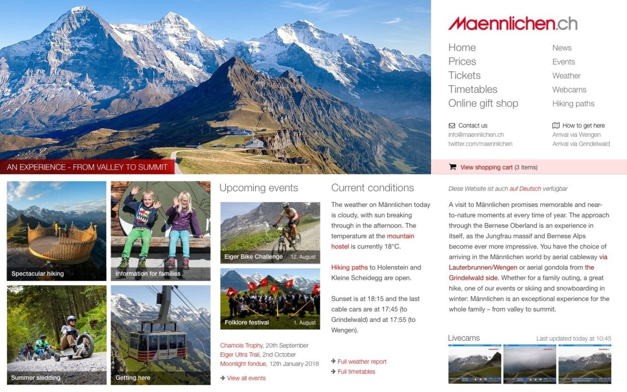
I looked at six websites which endeavour to encourage visitors to visit mountain destinations: verbier.ch, schilthorn.ch, titlis.ch, and jungfrau.ch in Switzerland, the more simply-designed British site at ben-nevis.com, and a closer look at local site maennlichen.ch. I looked at each site in turn with the conference attendees on a large screen, trying, without using an expert eye, to carry out simple tasks like finding out ticket prices, or current weather, or timetables. After thirty minutes, and a good exchange with the audience, I think that many took away the importance of providing website visitors with not just a better design, but also an easier path to the information they’re seeking.
This simple mockup, which I prepared as a starting point for a design recommendation for maennlichen.ch, shows how the current site could be improved greatly by simple re-organization of the front page.

The presentation is now on WordPress.tv and embedded below.
(Lead photo in this post is by Manuel Schmalsteig.)

