It still surprises me when I come across a technique which I haven’t used before when programming front-end website things. Such was the case when I had to program a Gutenberg block for a project I’m working on.
The design determined an image to the left of a block of text. The text needed to align with other elements in the right-hand column of the page, whereas the image needed to stretch to the left edge of the browser window.
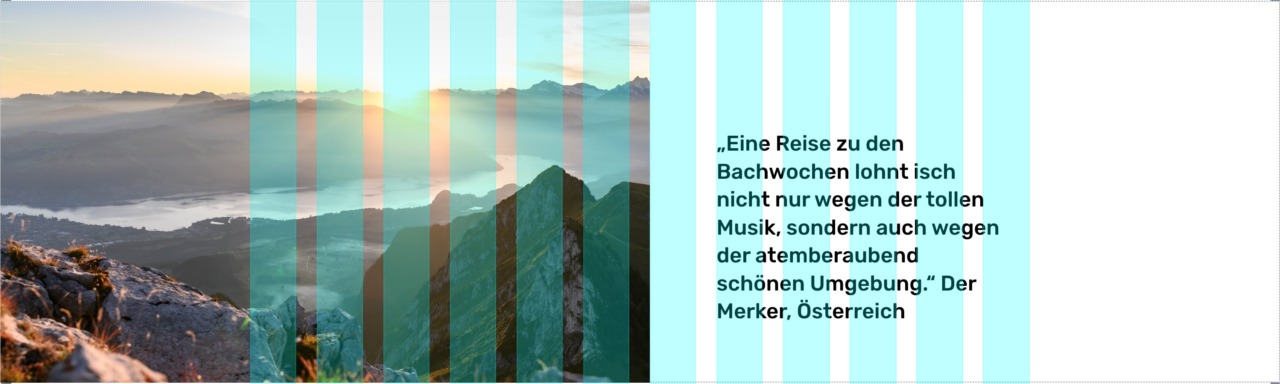
Most often, the contents of a multi-column layout are constrained in a main column, with equal outer gutters to the left and right ensuring that the column remains horizontally centred. (The area indicated with the blue guides in the image below.) The text in this example needed to be constrained by this column. However, the image broke out of this column to the left, whilst appearing to align with the text to the right.
I write “appearing to align” because the two components aren’t actually connected in a direct way in the HTML of the result.
<div class="wp-block-sht-image-with-text">
   <figure class="wp-block-sht-image-with-text__figure">
      <img src="https://source.unsplash.com/random/1200x800" alt="">
   </figure>
   <div class="wp-block-sht-image-with-text__inner">
      <div class="wp-block-sht-image-with-text__content">
         <p>Lorem, ipsum dolor sit amet consectetur adipisicing elit. Cum eaque iste odit rem ut. Ex placeat sit deleniti sint id quia dolorum, voluptatibus doloremque et? Officiis fuga in eaque quod.</p>
      </div>
   </div>
</div>
After a little bit of head-scratching, I decided to deal with the image and the text separately. The image is 50% of the width of the screen, plus half the width of one inner column gutter. My project uses CSS variables for the columns and gutters, so I can use them to work out the total width of the image.
.wp-block-sht-image-with-text__figure {
    width: calc(50vw + (var(—grid-column-gutter) /2));
}
The text is inside the regular content area, so I can use the CSS sizing variables here too.
.wp-block-sht-image-with-text__inner {
    display: flex;
    justify-content: flex-end;
}

.wp-block-sht-image-with-text__content {
    flex: 0 0 calc(--grid-column-width-5);
}
The result is that the image and the text column are both the correct widths. However, without some trickery, they won’t align with each over vertically; the figure and the inner elements will be on separate lines.
My first thought was to use position: absolute on the figure, but this lead to problems with the next Block in the content. (Using position: absolute takes an element out of the page flow, so the Block following this one will be overlapped.)
CSS Grid to the rescue. Although it’s meant for creating grid layouts, a handy feature is that you can add more than one HTML element to the same grid area. This means adding the definition display: grid with one column to the main containing div, then placing both the figure element and the inner columns container in that single grid area (row 1, column 1).
The final code and a working example are here at Codepen.
