It took me a long time to fully appreciate the differences between exposure and preset colour profiles in Lightroom. Colour profiles are easily overlooked as they’re just one setting alongside the basics of colour, contrast, lightness, clarity or more advanced adjustments using curves or tonal adjustments (highlights, shadows, whites and blacks).
Colour profiles are like “presets”, which give you a starting point which are often intended to give an edited photo a particular “look”. They’re not intended as a replacement to colour or exposure correction, nor are they to be confused with actual “presets”, which allow you to apply the same editing settings to more than one photo.
Different camera makers provide their own colour profiles and if you’re shooting your photos in RAW format, you can change the profile to give your photo a different “look”. Adobe’s own settings are “Color”, “Landscape”, “Portrait”, “Standard” and “Vivid” and are available to all RAW-format photos. Profiles from specific camera makers are only available when manipulating their own files.

These Adobe profile names are actually slight misnomers, as a particular landscape photo might benefit from the application of the portrait profile. A better way to think of them is their effect: the Adobe Landscape profile increases the saturation and contrast, whereas the Adobe Portrait profile only darkens the shadow areas slightly. Each photo will be best served by using a different colour profile; this isn’t a one-profile-fits-all solution.
Fuji provide profiles which help you to approximate the look and feel of film photographs (albeit without questionable grain or patchiness). Depending on the kind of shot you’re taking, one profile or another will work better. The Velvia profile is the most extreme of the dedicated Fuji options, intensifying greens and blues and increasing the depth of blacks.
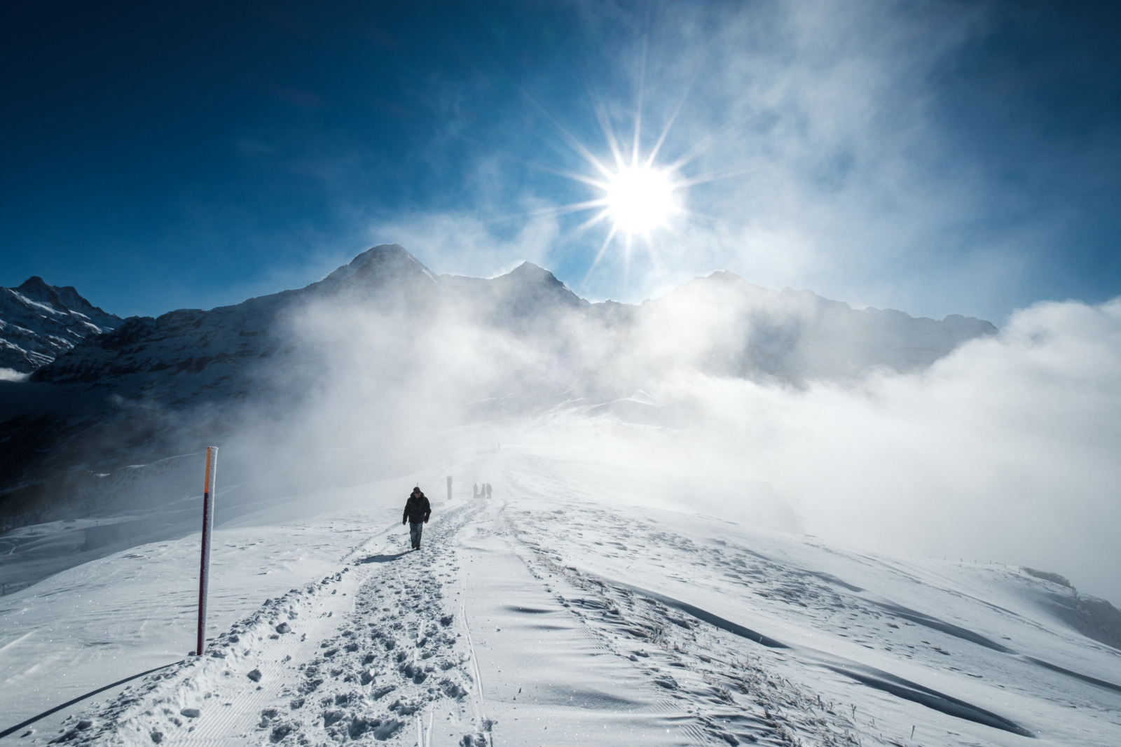
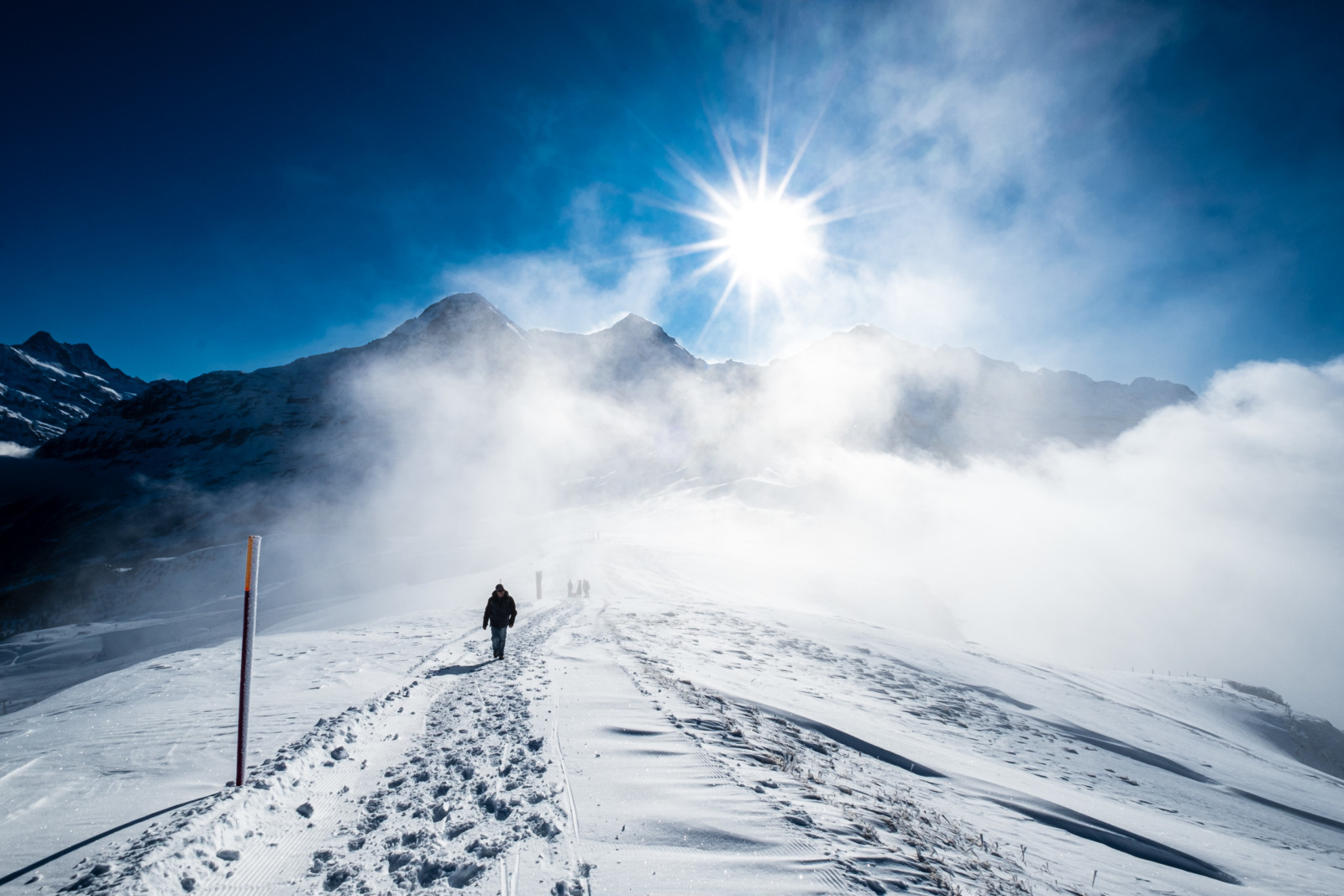
Much in the same way as using Fuji Velvia transparency film required very precise exposure, the digital version doesn’t suit all images. Take the following example of a photo from Männlichen this January: the blue tones in the Velvia image make the scene look slightly odd and take away from where the viewer’s attention should lie: the drama of the frozen snow.
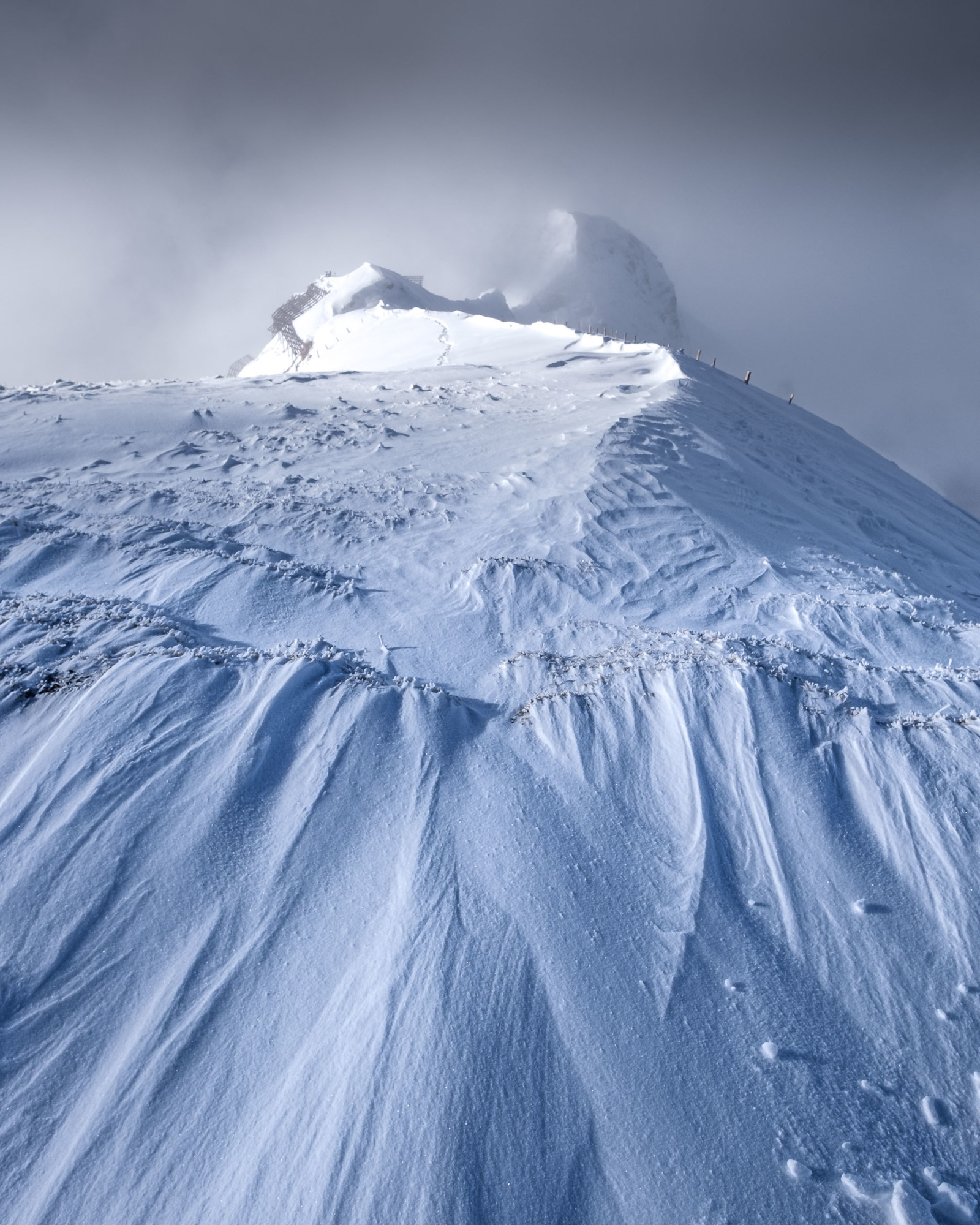
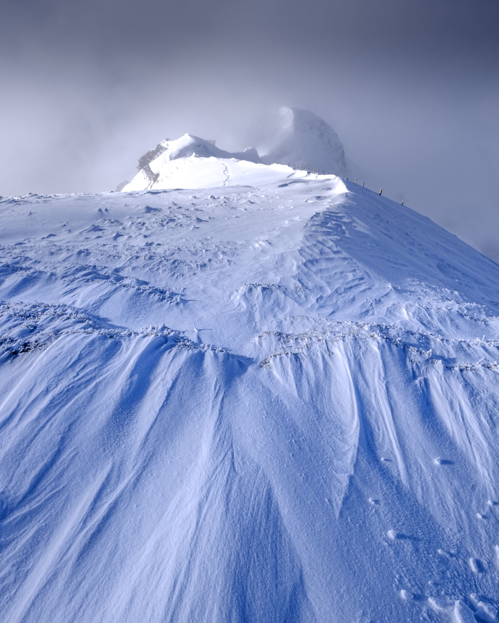
Through a lot of experimentation on a lot of images, and a particularly nit-picky attention to detail, I’ve found that the profile should match the mood of the photo. The shots on the mountain were all about the drama of the freezing conditions and drifting cloud, so they really needed the “punch” of a more contrasty colour profile. Although some colour profiles let lots of detail come through in shadow areas, these images were all about the “punch”. The following photo, edited once and then changed by applying different colour profiles, show an example of when editing a photo should be more about the feel of a scene rather than the details.

6 responses to “Using colour profiles in Lightroom”
OK, great, but could you please advise on how to control color profiles in Lightroom? I poked around the menus in LR, including preferences, and did not see anything.
– I normally control color thro the HSL panel, and sometimes thro Calibration, but have not heard until now of color profiles. I am interested!
Cancel my last question about where to find color profiles in LR. I saw a video on color control by Mark Denney and he mentions them as Tip #2 of 5 tips on controlling color in LR.
Only thing is, when I go to LR, altho I do find color profiles, I do not see Adobe Landscape or Vivid. I do see that Anthony Morganti has posted a video on how to import color profiles into LR, so I’m probably OK.
I do thank you for drawing my attention to this!
Pleasure! Hope you get on well with them. I’m guessing that the selection depends on the camera or file in use: you may well find that the list is shorter if you’re working with JPEGs or other files which don’t have embedded colour profiles.
Mark, thanks also for your comment on Nigel Danson’s Youtube video on best settings for posting on Instagram. You had recommended 2700 px on the long side. Do you have any recommendation as to the percentage quality? Also, some say to limit the file size to 1.6Mb. Do you have an opinion on that?
I’d just export it at 100% and let Instagram handle the further optimisation.
Cool, thanks!
PS I did get a great result in terms of image quality compared to the orig with your 2700px recommendation when I posted on IG yesterday