Back in 2017, when I was working on a project for Swiss railway company SBB, I needed to implement a so-called “image map” – a picture with which the site visitor can interact – which scaled according to screen size. Since then, I’ve continued to improve my techniques and through a great deal of focus on graphically appealing projects, I now use a solution which uses Scalable Vector Graphics (or SVG for short).
The topic comes up fairly often and the reason I’m writing about it is because of the popularity of the blog post I wrote at the time. Then, I was using a combination of responsive CSS and jQuery to adapt the image to fit the screen size.
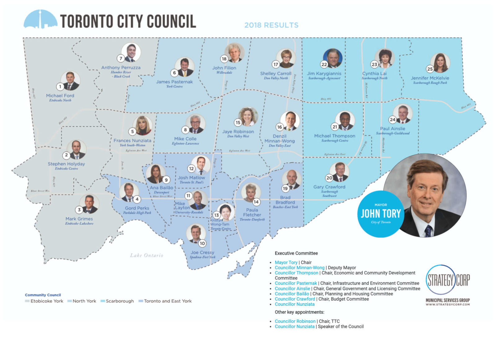
The project which prompted me to write about the more up-to-date was an interactive map view for a for a company providing Toronto city council election results, which I programmed on behalf of our Swiss web agency Say Hello. We received the project after the managing consultant found my original blog post.
Having developed a more advanced solution since 2017, it made sense to implement the most flexible and responsive alternative possible.
The previous solution depended on JavaScript to make it work at all sizes, but SVG are responsive by default, provided that you prepare your CSS and HTML appropriately. An SVG is, essentially, a type of XML file and so it’s easy enough to build a view like the one above in Adobe Illustrator (or the like), giving each path its own identifier. (By preference a CSS class name, but alternatively a unique identifier (id)). This is how most graphic designers work, so adding the class name or ID to each path can fairly quickly be achieved once the SVG has been exported and optimised.
Once the main graphic has been prepared, you need to wrap it in a DIV or SECTION tag, which is styled using position: relative. For this example, I then duplicated the paths of the original SVG but without the background image. This meant that I could add the secondary, transparent SVG using pposition: absolute and a higher z-index, thereby overlaying the original image and matching the original areas. Although the visitor can’t see the effect, the map is actually formed of two layers; one for the visual aspect, and an overlay for the interaction.
I used a secondary layer so that I could wrap each path in the overlay with an A link tag. Once this was in place, I could add a JavaScript onclickevent to each path, which displays more information when the visitor clicks on the relevant map area.
The styling of each path in the map, which you can see by hovering over each region in the final version, was achieved through applying simple :hover rules in CSS. (In SVG, you work with filland stroke, not borderand background.)
path: {transition: all 150ms ease;}
path:hover {stroke: #333;}
The “responsive” aspect of the solution was the easiest of all; as the width and height of the SVG isn’t set explicitly by inline attributes, it adapts automatically to the size of the container. Although the map is barely legible at the smallest screen sizes (due to the visual content provided), the implemented technique for scaling the map holds up across all screen sizes.
