A huge organization like SBB CFF FFS – the Swiss national railway company – has many online and offline projects; from the marketing posters on hoardings and in stations to the main website.
Alongside the three heavily used sites for German-, French-, Italian– and English-speaking users, there is a myriad of smaller sites for specific projects. Each of the sites has its own look and feel, which SBB is starting to corral: both administratively and in terms of corporate identity. The branding and marketing teams are working vigilantly on an online style guide, which sets out the guidelines (and stricter rules) which should, in the long-term, apply to all SBB products.
Many of the SBB project sites are created for SBB by third-party agencies, like the one I work for. We at !frappant have worked on a lot of print media projects for teams in the SBB and we’ve been working on a few small digital projects over the past couple of years.
One thing is clear: the common design elements of the “Panel” – a red polygon on a photographic background – is fast becoming ubiquitous in the SBB communication. Our newer digital designs are reflecting this and our designers are working with close attention to the new style guide; endeavouring to match modern and fresh design work with the guidelines set out by SBB.
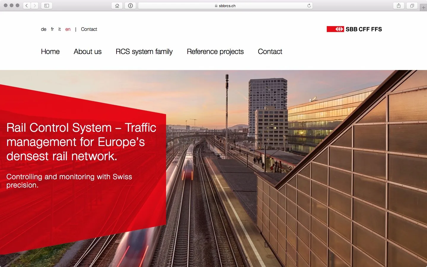
The red panel is already implemented on many websites: usually as a static image, with a fixed size and a fixed, non-responsive text embedded in the image. As part of a relaunch of one of the project sites, I set myself the challenge of creating the panel element using modern technology, so that it works on all popular devices according to responsive design principles, and so that the text content can be edited in whichever CMS is being used to run the site.
The first task – to create a semi-transparent red polygon – was relatively simple. Using Scalable Vector Graphics provided the solution: SVG is a technology which has been supported in web browsers since 2011. Placement of the text – a title and subtitle – is simple enough, using CSS media queries to adjust the proportional size and appearance at different breakpoints.
The SBB style guide indicates a specific requirement: that the red polygon isn’t just transparent – which would lead to the red colour shifting away from the official #EB0000 hex value – but is to be implemented using the multiply blend mode. This allows the background photograph to shine through the panel, whilst ensuring that the red colour remains constant, irrespective of the colour in the background.
That was a head-scratcher, but I found the solution after a little online research. By following the style guide’s instruction, I built the inline SVG code with a series of elements: a rectangular rectangular polygon for the base of the text and two triangular polygons to make the top and bottom edges.
The code was updated in December 2016. In order to avoid sub-pixel rounding issues, in which the space between elements was visible on high-resolution screens – the sample code now uses a simpler polygon shape for the quadrilateral panel object. (One red, and one white to allow for the correct multiply blend mode effect.)
In order to achieve the required ”multiply” blend mode on the red polygons, I applied the following rules.
- A white base layer with regular 70% opacity.
- A red overlay with CSS’
mix-blend-mode, on top of the white layer, with identical proportions.
As mix-blend-mode is not yet supported in all but the best modern browsers, I added a fallback using JavaScript: if the mode isn’t supported in the visiting browser, the colours are set using CSS opacity in additional CSS rules. This means that in unsupported browsers, like Internet Explorer and Edge, a manually determined red hue is applied instead, and the effect is only obvious to those who are really looking for it.
The JavaScript is only applied dynamically if mix-blend-mode isn’t supported, so as soon as a browser begins supporting it, the “proper” solution will automatically be applied.
As far as I know, this is the first responsive implementation of the SBB Panel online using SVG and HTML5 technologies, which gives me a warm glow inside. By coding the Panel using modular CSS and HTML, I have a solution that I can drop into both WordPress and TYPO3 implementations.
Visit sbbrcs.ch and sbbimmo.ch (site content only for logged-in users) to see the new Panel in action.
The basis code for this example is available to download at Github.

2 responses to “Technical case study: the SBB CFF FFS brand panel”
I like how the text also changes on SBB RCS when resizing the window; truly responsive.
Cool feature!
Thanks! Responsive isn’t just about the positioning of elements. Few sites take proper time and care to manage text sizing for various viewport sizes, but it’s something I’m very keen on.