I was at the WordPress Bern meet-up a little while ago, held on the topic of WordPress Themes. An interesting conversation came up about page layouts, with a specific subject being the trend for large images in the top section of web pages.
Such layouts have been very fashionable since web developers and designers found that they could specify the height of elements in viewport units, making images fill the screen when first arriving on a page.
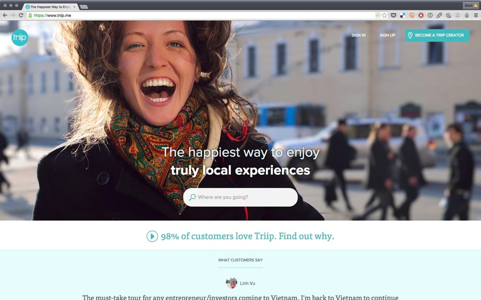
This look is everywhere, which you can see immediately if you visit this list of “inspirational” website landing pages. These sites look good, there’s no doubt. But they almost all follow the same basic idea: large blocks of content, large images, and an especially large block right at the top of the page. This usually leads to the viewer seeing something like this when opening the website.

OK, so is that a bad thing? Not necessarily. But a web designer must first consider two things: what is going to appear within this section, and whether that’s what the person visiting the website wants to find.
Huge Inc. ran some tests and found that all but a tiny handful of visitors will try to scroll down the page if they don’t see what they’re looking for straight away. This brings rise to the argument that “the fold” – i.e. what is visible above the bottom edge of the visible viewport without scrolling – doesn’t matter any more.
Everyone scrolls, so does it matter what content appears above or below “the fold”?
Yes. Absolutely.
What has been forgotten when advocating that “the fold” doesn’t matter is that although the visitor can scroll down and will scroll down, the fact that if they have to scroll down, this is an inconvenience. Which is, in the vast majority of cases, avoidable.
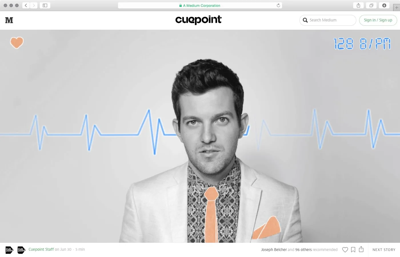
In many cases, the visitor may not be familiar with such layouts, and be a bit bewildered that on a site like Medium, the article text often starts below a massive header image. On loading the page, there is no indication that there is even any text to be read. A less-savvy internet user, who are in the majority of the browsing public, may even go elsewhere instead of staying on the site. You’ve lost a visitor by hiding the information they’re looking for.
For someone who arrives at Medium expecting to read an article, this view is off-putting. Sure, the visitor will scroll. But if the site is about articles and writing, why place 90% of the importance of the initial view on an image, which does little more than act as a graphic design element?
The example in the screenshot below actually expands to fill the screen and hides the text on purpose. It places more emphasis on a link to the “next story” (at the bottom right of this view) than to the actual content, which is hidden “below the fold”. This is contradictory to anything I’ve ever learned about usability.

Whilst graphic design is a key part of any website, the designer, programmer and (if there is one) the user experience specialist need to consider who the target audience is for the website. There’s not necessarily a need to squish as much as possible into the view “above the fold”, but many websites would benefit from putting more information in this first view.
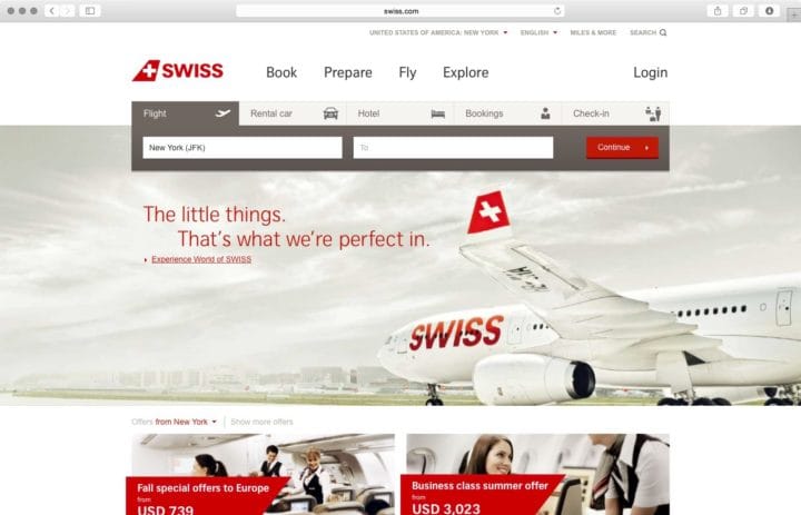
A rule of thumb for interaction design is to make the interface attractive and easy to use, providing the visitor with as few hurdles to overcome on their way to the information they want. Filling the screen with a lovely picture is a nice welcome, but putting information and tools which the visitor needs there too is much better. Swiss Airlines‘ website is a good mix: a big picture, but also the most important navigation links and tools for flights, car rental and hotel bookings.


