CSS has reached a pretty good level, where all of the modern browsers – and with that, I mean Internet Explorer 9 and all of the more recent versions of Safari, Firefox and Chrome – are able to correctly deal with some pretty cool effects. Since the implementation and correct support for CSS 2, we have the ability to rotate, skew and animate elements without going anywhere near JavaScript. Only Internet Explorer 8 throws a spanner in the works, but even here, most clients we work with are happy to accept fall-back solutions for this outdated browser, at extra cost.
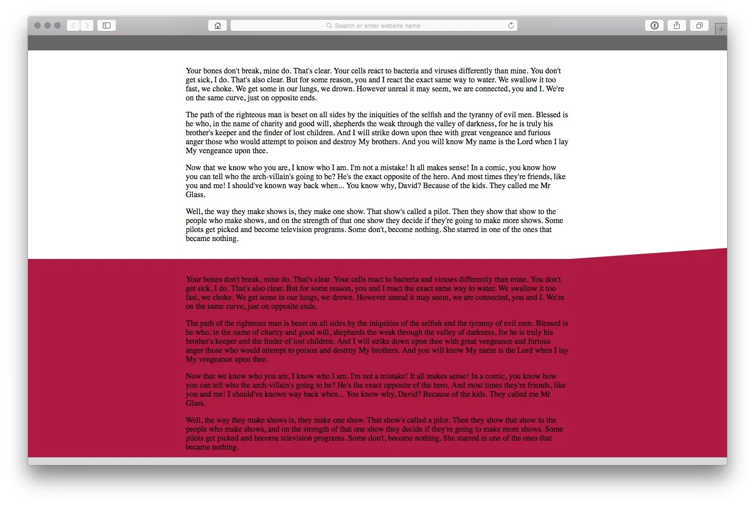
The latest code that I’ve worked on is for an upcoming work project, in which I needed to make some diagonal edges for content containers. The page layout is separated into rows – much like many current web designs – and the designer defined that some rows may be enhanced by a diagonal “up-thrust” on the right-hand side. The screenshot at the top of the page shows you what I mean.
The centre “column” – <div class="inner"> – is set to a max-width of 768px for the sake of this example. Once the browser is wider than 768px, then the red “row” receives a diagonal lifting edge on its right-hand side. Anchored at the junction of the right-hand side of the centre column and the top of the red row, it slopes upwards – infinitely – at a fixed angle of 4°. This means that no matter how wide the browser window is, the angle remains the same. Given that the content will always be at least a couple of paragraphs tall, there’s no issue with overlapping that I can measure.
So: how do we achieve this? By adding an block-level, absolutely-positioned CSS pseudo element using .inner:after. We used to need to add an actual DIV to the markup, but not any more. Since CSS 2, we can use pseudo elements, created directly in CSS, to achieve the same goal, then use CSS transformations to rotate it. Change the colour of the pseudo element to yellow, and you’ll see the result.

(A note about rotation: the usual axes are based on the centre of the element being rotated. In this instance, we need the element to be anchored at its top left corner: that’s where CSS transform-origin comes into play.)
The next problem to deal with is that the (currently yellow) element exceeds the width of the page by some way: it needs to be at least 1300px or so wide for the largest monitors on the market. As you can see in the screenshot, this means that it sticks out of the right-hand side of the page. A simple max-width: 100% and overflow-x: hidden on the overall content wrapper – to hide everything outside the horizontal bounds – does the trick. Then inherit the background-color of .inner and you’ll get the result you’re looking for.
Here’s the relevant section of the HTML:
…and here’s a LESS mixin containing the appropriate CSS rules:

