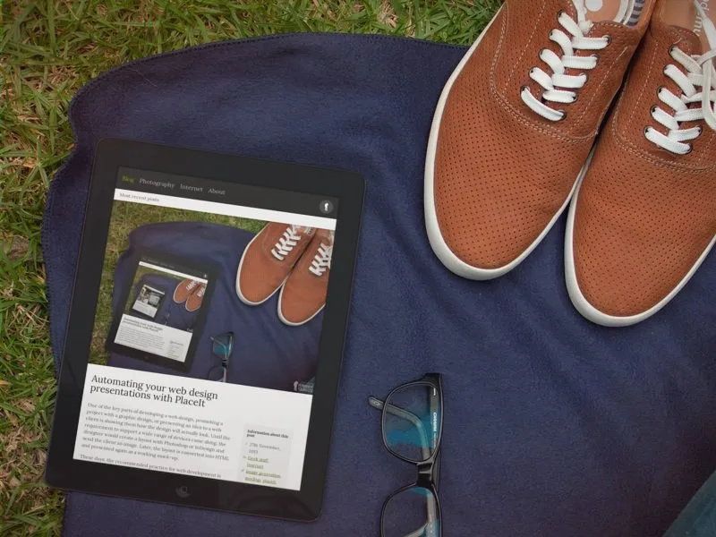
One of the key parts of developing a web design, promoting a project with a graphic design, or presenting an idea to a web client is showing them how the design will actually look. Until the requirement to support a wide range of devices came along, the designer would create a layout with Photoshop or InDesign and send the client an image. Later, the layout is converted into HTML and presented again as a working mock-up.
These days, the recommended practice for web development is for a designer to work up the colour scheme, page layout and specific design elements such as video players, galleries and forms. The interface programmer then builds a working prototype and presents it: not as a static image, but in the browser. That way, the client and the designer can see how the page works and how it “feels” in a real-life environment, and the budget for design work is used much more efficiently.
It’s easy to load a website in a browser on your computer, but not so easy to imagine how the site will look to visitors using an iPad or a smartphone. How big will certain elements look to users with these devices? How can the client see the end effect without actually using an iPad, or a wide range of available internet-capable devices?
A great service called PlaceIt allows you to upload a design and have it appear superimposed into a “real” environment. The service also allows you to enter a public web address and generate a live image of the website for you. The following examples, and the one at the top of this post, are examples from my own website, created automatically and for free. (Commercial use or images at a higher resolution are available for a fee under an image-by-image charge or under a subscription plan.)


2 responses to “Automating your web design presentations with PlaceIt”
Quite handy, I will proberly use/test it myself.
Thanks for the link!
A short thought about the process:
I think it’s the designers task to create an interactive prototype, these days.
Only this way it’s possible to create an interaction design that rules
and shorten the documentation to give to the developer.
The sheer level of complexity in modern layouts and designs may be too much for many designers to generate themselves for cross-browser support. I’d be open to the idea, but the work for the layout programmer wouldn’t be any easier… and may even be more difficult, as it would mean completely re-coding the HTML and CSS in many instances.