
Posts about Responsive Design
The term “responsive design” applies to web design principles, when a website is optimized for viewing on any device, from a smartphone to a super-sized t.v. screen.
-

Using modern web technologies to replicate the ubiquitous red panel used by Swiss railway company SBB CFF FFS.
-

I’m not a fan of one-page websites, as a rule. But making sure that they load as quickly as possible goes a long way to making them acceptable.
-

Using modules in front end web programming to allow more flexibility and more independence from site layouts for content elements.
-
Laying out a page using percentage-based columns seems to be pretty easy. However, in responsive layouts, you’ll quickly run into problems if you don’t take legibility into account. The most obvious case is when the columns are predominantly text-based, where a suitable gutter between the columns is essential for the sake of legibility. (If you…
-

The first in a series of posts outlining the basics of how designers can plan layouts for the widest possible range of internet-capable devices.
-
The term “responsive design” refers to the fact that a website is suitable for viewing on any device, from a smartphone to a super-sized t.v. screen. But is it actually important, nearly four years after the requirement became prevalent, that this term is still applied when selling a project to a client?
-
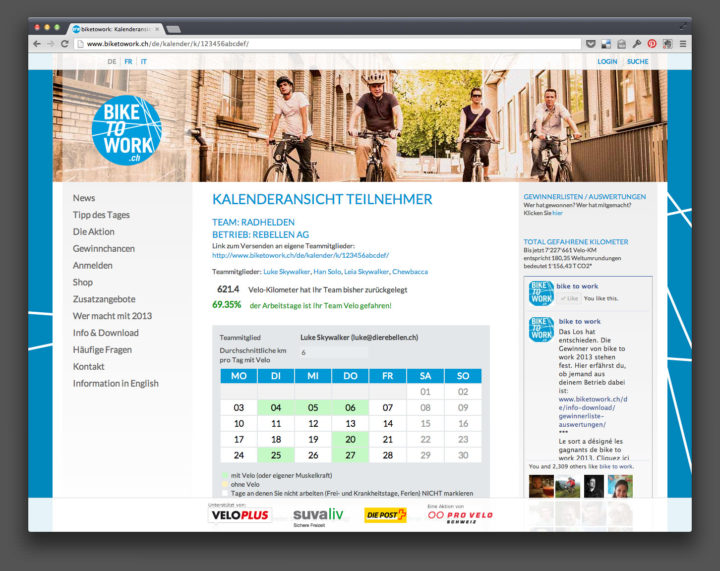
Back in 2011, the organizers of Bike To Work Switzerland approached my employer !frappant Webfactory to re-develop their website and the participants’ admin system. I worked with a third-party usability consultant to re-think and re-design the project, before I carried out the design work in Photoshop and the team and I subsequently produced the website on the base…
-
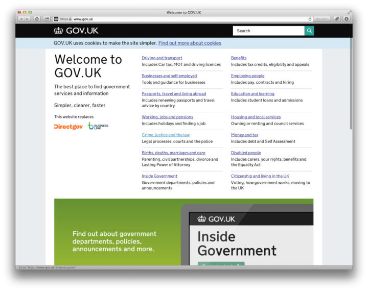
The British Design Museum has announced its nominations for the 2013 Design Awards, amongst them the fascinating Rain Room und the latest Windows Phone. But the nomination which interests me the most is the British government’s website gov.uk. The website is the latest version which attempts to begin bringing all of the various government websites under one roof;…
-

The new, re-designed website is now online and is automatically optimized for visitors with iPads and smartphones. One of the aspects of the design is an improvement to how images in vertical format are displayed.
-
If you’re like me, a web developer, and programme responsive web layouts using @media queries, you’ll often get lost knowing precisely which set of rules are currently applied to the page. Here’s a handy tip to make things easier.
-
I have finally been able to completely re-build this website from the ground up, using responsive design principles and many new features. This first technical post summarizes the reasons behind the need for a new version.
-
Cool new techniques for creating responsive websites and for saving you loads of time when writing CSS are helping me to rebuild the technical infrastructure of this (and other) websites.
-

One of the great things about being responsible for the technical direction of a team of developers is that you get to bring your ideas to a project and, in many instances, try out new techniques which would otherwise only be seen on a personal website or blog. I wrote at the beginning of the…
-
If you’re a web developer, checking that you use the standards of the web and valid code will make your life infinitely easier. By planning now for a standards-based future and focusing on HTML5 and its associated technologies, you’ll be building for the future: not just saving yourself time, but also making sure that the…
-
Re-programming my online portfolio using the most up-to-date techniques possible.
