
The British Design Museum has announced its nominations for the 2013 Design Awards, amongst them the fascinating Rain Room und the latest Windows Phone. But the nomination which interests me the most is the British government’s website gov.uk. The website is the latest version which attempts to begin bringing all of the various government websites under one roof; using adaptive design to allow maximum legibility and usability for all visitors, whether via desktop computer or via mobile devices.

Although one could argue that the typography and colour choices are well thought out, the nomination is unlikely to have been made because of the visual aspects of the website. The most immediate point which strikes the visitor is a lack of unnecessary images: there are practically no stock images on the website to distract the visitor on the search for information.
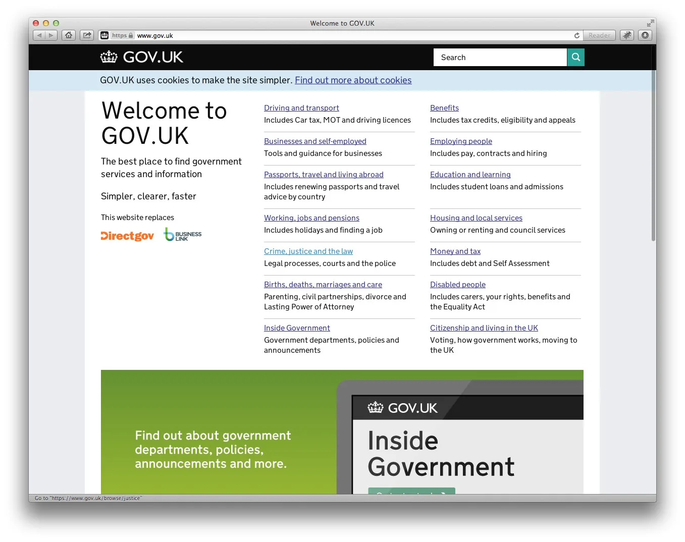
What also strikes me, as a web developer, is that there’s no classic menu: the visitor arrives on the front page and is immediately presented with a list of the main topics of the site; lower down the page, in second priority, are a few theme-based “teasers” to guide visitors to specific, currently useful topics. As was the case with internet innovator Compuserve, the visitor clicks through themes hierarchically until reaching the required information. In my tests, every piece of information I could conceivably need was reached in three to four clicks: an unofficial goal which has been set in website structure lore since the 1990s.
If the visitor is impatient – well, we all are, aren’t we? – then there’s a prominent and well thought out search tool on every page. Looking for information on income tax, for example, doesn’t just return a halfway useful list of vague search results: instead, there is a very clever categorized results display, which helps the visitor to find the best result for the search before even leaving the results list page.

I find the idea of this kind of navigation inspirational: it breaks the mould of the classic menu-at-the-top-and-submenu-at-the-side layout which is so ubiquitous. Although this kind of navigation can’t be implemented to every website, it’s a very clever idea for an information-based website with so much structured information. Let’s be honest: does a website visitor really want to use a four- or five-level hierarchical menu to jump straight from information about maternity leave to information about road tax? Or would it be easier to use a search tool to find information on a topic, then use it again to find information on a second topic?
For a web designer and a client, the problem of a multi-level website menu presents itself for every project. How can such a large menu be implemented so that it can be used on the small screen of a mobile device? The short answer is that it can’t: the developer would spend his time – and less of it – building a more intelligent search tool. Would a visitor using a mobile device be better served by using a search tool or by having to scroll through several screens’ worth of links until the required page can be found?

Leave a Reply